Tuesday, 28 March 2017

Front Cover Feedback

I took a picture of the feedback I received for the front cover of my soul and jazz music magazine. I gathered it all by printing it out and getting people within my target audience to write down their opinions on post- it notes. 


Monday, 27 March 2017

Front Cover Linked to Research

This is a Prezi showing how much the research into soul and jazz magazines has influenced the production of the front cover of my music magazine.

Sunday, 26 March 2017

Cover Layout/ Changes


Here is a video, explaining the the layout and its changes of the front cover compared to the flat plan I had produced previously.

Thursday, 23 March 2017

Photograph Manipulation

This is a PowerPoint Presentation explaining the steps into producing the final image for the front cover of my soul and jazz music magazine.

Front Cover Features (Text)

This image explains my decisions for the features of my music magazine.

Wednesday, 15 March 2017

Masthead Decisions

Here is a PowerPoint explaining the steps of producing the masthead of my jazz and soul music magazine.

Sunday, 5 February 2017

Test Shots

I produced a video using iMovie and Premiere of the test shots I have taken for the front cover, contents and double page spread of my music magazine. This gave me a rough idea of where I want the mise- en- scene of the images to be and what I want my artist to be doing within the shots that help present her as a soul/ jazz artist. Regarding the hair and makeup of the model, I like the simple makeup look so that most attention goes to her hair. Some of the images I've taken, have potential use for the double page spread because they link really well with my genre and feature colours that I plan on using on the front cover.

Saturday, 4 February 2017

Shot List

 This is the shot list for my Jazz/ Soul music magazine and why I've chosen certain positions and locations for the front cover, contents page and double page spread.


Friday, 3 February 2017

Model Consent Form

Here's the artist for my music magazine holding a model consent form. 

Wednesday, 1 February 2017

Flat Plan Feedback

I placed the scamps of my front cover, contents page and double page spread in front of a couple of peers who match the target audience (16+) of my music magazine. I asked them to feedback what things they like about the flat plan and what they would possibly change. 


Flat Plan/ Deconstruction


Tuesday, 31 January 2017

Jazz and Soul Visual Moodboard

To give a little introduction of the genre of my music magazine, I've created a visual moodboard to present some of the words and music related to the genre. 

Wednesday, 25 January 2017

Tuesday, 24 January 2017

Artist Profile

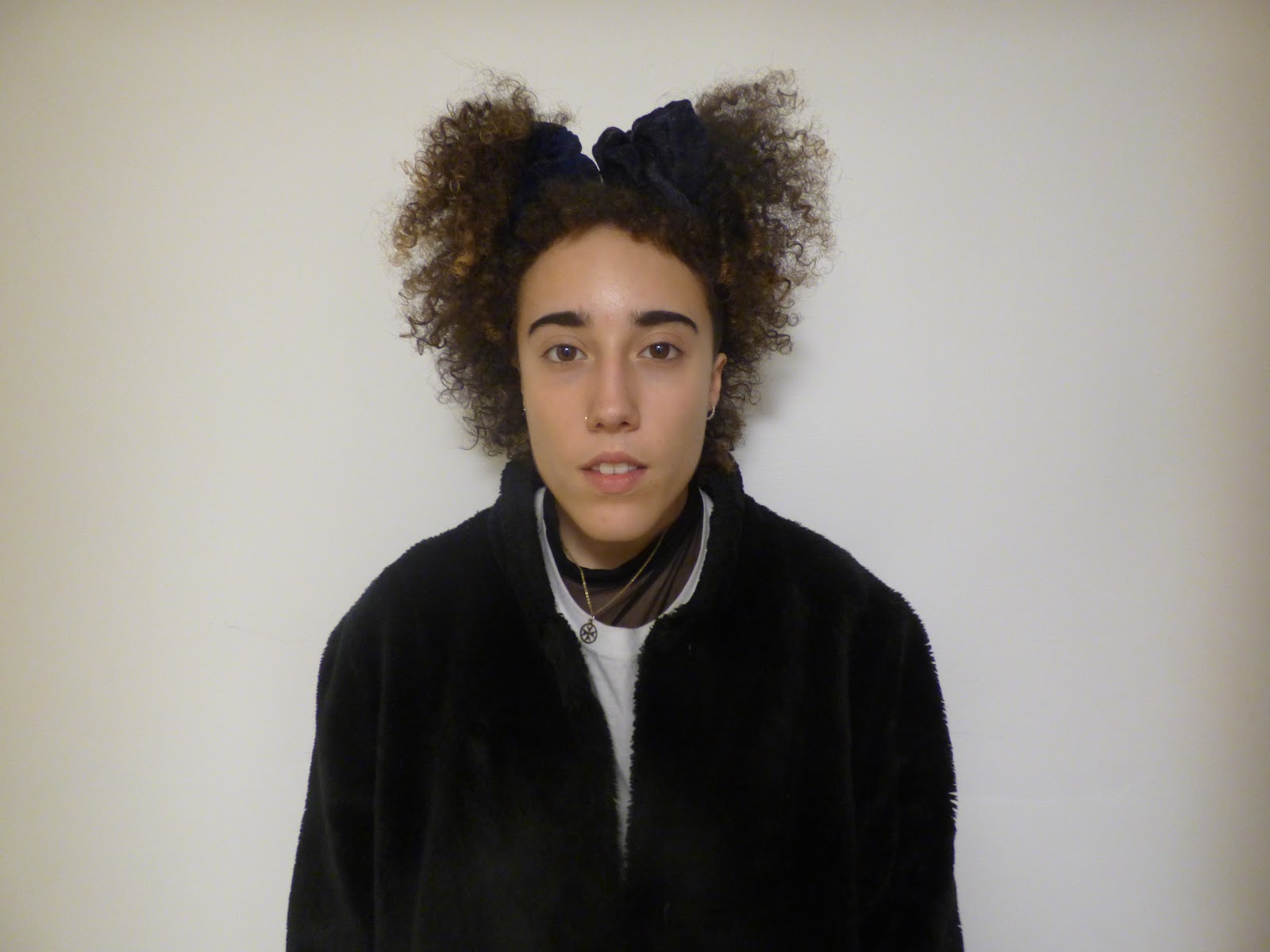
This is a video of the artist (Little Robyn) of my Jazz/ Soul music magazine I'm going to produce, introducing herself and talking about what her music is about. 

Audience Research & Analysis - Focus

Here is a PowerPoint presentation of the audience research (focus), with the questions and answers from the two people I asked. Because the target audience of my music magazine is 16+, I decided to have one friend of 16 and the other a family member who is middle aged to help me with this section of my research. I have also made sure that for this part of the audience research, due to the fact that it's more focused on my music genre of the magazine, I ensured that both the people I had received help from, had an interest in jazz/ soul music.

Monday, 23 January 2017

Audience Research & Analysis - General

I created a survey on Google Forms for my general audience research. I sent the link to 18 of my contacts and asked them to fill it out. I sent the form to people of different ages to give the results more of a range like my target audience of my music magazine.  With the information I have collected by producing and sending out my survey, when making the magazine, I can cater to my target audience's requirements of what they like to see in a music magazine.

1)
From these results I can infer that the most common genre of music listened to is R&B/ Hip Hop, whereas second is Pop, Jazz and Soul or another genre of music. These results can help me to produce the music magazine successfully because I know that it will reach a good number of people who actually enjoy listening to the music genre of jazz/ soul. 

2)


After receiving the answers to question number two, I can tell that a lot of artists people listen to are mostly artists who don't fit the genre of my magazine. A couple responses mention Jazz and Soul artists such as Lauryn Hill and Amy Winehouse. By asking this question, I could get a general knowledge of what people within my target audience listen to and possibly features some articles inside my magazine of the singers mentioned; helping me to reach out to audiences more.

3)

This question was one of the most useful in the survey for helping me with creating my music magazine and catering to my target audience. From these results, I can gather that, in my magazine, I should include new music and artists emerging into the music industry. Also, I can infer from the results that I should put artist interviews and tour dates in the music magazine as this was also a common answer to the question. 

4)


I asked this question so I can get a little bit of information about what I would need to include (on my front cover especially) so that the magazine would appeal to audiences. From the answers of the question, I can tell that while making the music magazine, the image on the front cover should look original, making the model stand out. I could do this by working with what my model will wear and the props used. I can also see that majority of the results are that the feature which makes them buy a music magazine is what's written on the coverlines. This tells me that I will need to include text of interesting features inside the magazine, in the coverlines. 

5)


From the results of this question, I can now get a good sense about what questions I should ask the artist of my magazine, this way I would be informing my target audience about things that they actually want to know about. A common answer to the question was what influences and inspires the artist. Also, I've found that in an interview, many would like to know about upcoming music and gigs that the artist is doing anytime soon. By receiving these results, I will be sure to use the answers when producing the double page spread in my music magazine. 

Artists in Jazz/ Soul

This post is my research about a few jazz/ soul artists: Amy Winehouse, George Benson and Sam Cooke.
I've found that all artists present/ presented themselves in similar ways. For example, the guitar is a common instrument used within the genre. Also, their styles of clothing are relatively unique, especially Amy Winehouse and her hair. Because Jazz and Soul is music which had become mostly popular in 1920s-60s, the fashion of older artists go well with that time period; however, Amy's fashion can be considered vintage in order to fit well with her genre of music she produced. 


Saturday, 21 January 2017

Introduction to Soul and Jazz

Here is a Prezi I have made introducing soul music, the history of it, what's been influenced by it and main old and new soul artists.

Thursday, 19 January 2017

Research Rationale

I plan to produce a Soul/ Jazz music magazine with a target audience of 16+ since it’s hard to put a specific age range on who listens to soul. I have a wide access to my target audience, for example I go to sixth form which has an age range from 16-18. Also, I have access to young adults and adults to help me build my research. This will help me to gather accurate information and cater to what they look for in a music magazine and what attracts them to purchasing one.
For the research into making my Soul/ Jazz music magazine, I will do two types of research: general and focused. I will put together a set of questions around what people’s interests are in music, what they like to see inside a music magazine and what attracts them into buying one. This will help me with my general research as I should be able to gather a good amount of feedback to influence my magazine. As for the focused research, I am planning to get a few magazines already published and show a small group of people; asking them what they like and dislike about them. By doing this type of research, it allows me to get a good understanding of what those belonging to the target audience of my magazine, expect and like to see.

To produce my research I will have to create a set of questions on Google Forms and send it to people, obviously belonging to the target audience of 16+, for them to fill out and send back to me. My focused audience research will require a few different magazines that I can use to get feedback on. I intend to video the couple of people who will give their opinions and ask them why/ why not they make like or dislike the exemplar magazines that they are shown. 

Wednesday, 18 January 2017

Magazine Typography Moodboard

This is an image moodboard that I have created featuring different fonts used on music magazines for their mastheads.

I've found that the majority of the masthead fonts can help to identify to audiences what type of magazine they belong to. For example, 'Kerrang!' instantly suggests that the magazine has something to do with rock/ metal music because of the cracks in the text as it's seen as quite a ruthless genre of music. Additionally, the font is relatively simple, black, bold, san- serif and the letters are all connected; this helps to identify what type of music magazine it is because rock/ metal is usually associated with the colour black.
The 'Blue's & Soul' masthead gives away what genre of music the magazine is based on just from the name of it, however, the choice of feature colours have also contributed to it being easily recognised. The shades of yellow and purple give an older feel to it, helping to suggest a genre of music which had been extremely popular in past years.


Fonts and colours used for these mastheads meet the target audiences successfully. For example, the 'Billboard' masthead is more colourful than some other magazines because of the red, yellow and blue inside a few letters of the word. This will grab the target audience easily (most likely teenagers) as it gives off a more mature vibe than a children's pop magazine would due to the plain san- serif text and primary colours.

Monday, 16 January 2017

Music Magazine Moodboard


Here is a moodboard I created showing examples of different music magazines and what is currently featured in them regarding news within the music industry and songs in the charts.
From this, I can gather some features of a music magazine to include in the one I will produce. However, because these magazines are different genres to the magazine I am planning to make (Soul), there's a limited number of features I can use; such as, the 'Mojo' type feature colours- quite dim, associated with an older feel to it. Also, the idea of featuring who's big at the moment within the industry and the current news, which is is all the magazines above, I can use in my Soul music magazine.

Saturday, 14 January 2017

Music Magazine Deconstruction

Here's a PowerPoint Presentation of a 'Blue's & Soul' magazine
 features deconstructed and explained.

Friday, 13 January 2017

Introduction and Initial Ideas

This is a brief explanation of the music magazine project I'm working on, along with how I feel about it and what my initial ideas are for my magazine, Enjoy!

Friday, 7 October 2016

PRELIM TASK: Audience Feedback

I created a PowerPoint slideshow consisting of some feedback I have received from some peers who met my target audience. I had sent images of my final front cover and contents page to them and asked for their opinions or I handed the final printed copies and asked for them to video their responses.

Thursday, 6 October 2016

PRELIM TASK: Final Products and Cohension

This is the final front cover of my college magazine called 'Step Up.' I'm happy with the finished product because whilst producing this, I learnt new skills such as how to use photoshop. Also, I'm proud of what I've made considering the time given for me to do it was limited. As a first attempt at constructing a college magazine, the things I included are valid and link together well such as the coverlines and my chosen feature colours: black and pink.
The things I would improve on my college magazine however, is definitely my attention to detail; such as lining the text up neatly and making certain sections stand out more than others, being different to other products.


Here is the final of the contents page to my college magazine. It links successfully to the front cover due to the feature colours being the same on both pages, the fonts of text included and the fact that I've included the masthead again but in a smaller size on the page as well. Also, my choice of a white background is on the front cover and the contents page. Because of these features, my contents page can easily be identified from belonging to the same magazine as the cover page.
I'm happy with the final product because it meets my target audience's needs well as I've mentioned articles included within the magazine which are actually relevant to what the product is about.
I could definitely improve on specific details on the page such as typos and preventing from stretching the images which changes the shape of the model's faces.

Wednesday, 5 October 2016

PRELIM TASK: Contents Page Layout

Here is my final layout of my contents page compared with the flat plan I had produced. This shows what changes I had made and why but also the features on the page that I decided to keep the same when making it.

Tuesday, 4 October 2016

PRELIM TASK: Finishing Touches to My Contents Page

To finish off the layout of the contents page, I chose to ask for people's opinions on what they thought might need improving. The major thing which needed editing was the small empty space in the top left hand corner (shown in the first image). Also, the font I used for 'Step Up', appearing at the very top of the page, didn't quite fit nicely and looked odd. With this feedback, I came up with the idea of copying the font used for the masthead on the front cover of the magazine, to also be used for the small 'Step Up' text in the contents page. After, I turned the text to be sideways and moved it to the empty space. This instantly made my contents page look fuller. Completing the contents page, I increased the size of the text saying 'contents' so that it would be more in line with the name of my magazine (shown in images two and three).
Furthermore, to improve the college magazine contents page even more, I changed the font of the text to the same as one I had used for a coverline on the front cover, I did this because it makes both the front page and contents to link and easily be identified as being from the same magazine.

PRELIM TASK: Changes in Front Cover Fonts

After asking my peers about what they thought of my produced front cover to my college magazine, I received some helpful feedback about the fonts I had used on it. From this, I decided to make the last changes to ensure that the magazine meets my target audience successfully.


Monday, 3 October 2016

PRELIM TASK: Cover Layout Decisions

I changed the layout of the cover of my college magazine 'Step Up' in many aspects such as the positioning of the model, where the coverlines/ graphics would go and the anchor.
In the flat plan I had produced, drafting what the image on the cover would look like, the model had been sitting down at a desk full of work. However, I wanted to change the fact that they would have appeared to be struggling with the step up to A Levels, into an image of the model being happy and dealing with the adjustment. I managed to do that by getting the model to hold a checklist and smiling- showing how glad she is that she's done everything needed to be done and is doing well.
Due to the difference in front cover image, I therefore had to change the layout of where my coverlines, pull quote and graphics would be. I did this by going along with the feature colours (black and pink), ensuring that the text included was clear and easy to read. Along with this, because the actions being shown in the flat plan are different to the final image, I therefore came up with a different anchor to connect to the new photo.
Apart from the changes mentioned above, everything else I had kept the same in the final cover of my college magazine: the masthead and where it's positioned, the position of the anchor and the mid- close up shot of the model.

Sunday, 2 October 2016

PRELIM TASK: College Magazine Background Decison

Here I explained the difference between using the background of the picture I had taken on the front cover of my college magazine to cutting the model out of the image and placing it on photoshop. 


Thursday, 29 September 2016

PRELIM TASK: Font Decisions

This is a PowerPoint on why I chose certain fonts and colours to use on the front page of my college magazine. Enjoy!
PRELIM TASK: Final Front and Contents Page Images

                      
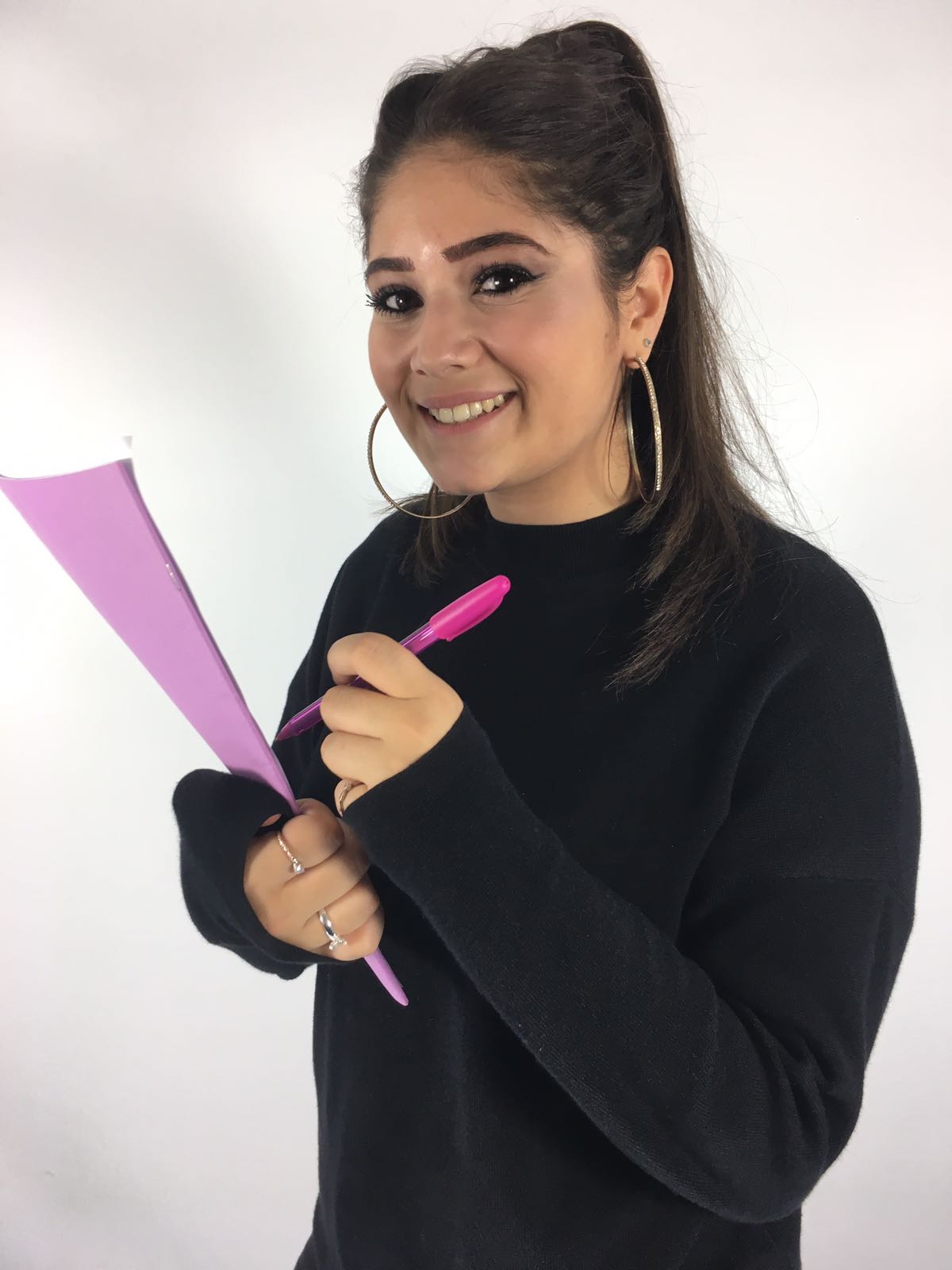
I have decided on this photo to be my front page image on my college magazine, rather than the rest I had taken, because it relates the most to my initial ideas of what I want the magazine to be about.
The image is of the model holding a text book, however it has a checklist on the paper in front- hence why I have got her to carry a pen to represent 'checking things off' the list.
My final front cover picture goes well with the magazine as its target audience is for Year 12 students, helping them out with how to handle the year. The model in the image looks happy with all that she's accomplished from the to- do list in her hand; this encourages others that they can bet through work if they were to, for example, make a list too.


I have chosen to have this picture incorporated
in the contents of the college magazine
because it's mise en scene is in the
common room, presenting that it's possible to
work on subjects whilst being around
other people in the year group.

In the contents page, I'll include this image
because it shows that yes there is a
lot of work that needs to be done in
Year 12 but there are times when
it can be completed whilst
being with friends; enabling you to
help one another. 
This image will be inside my contents
page because it does connect to my title but

it also shows that there are still times when 
students might have completed all work needed
and are then able to actually be with friends and 
have fun. 

I've included this image of the model
walking up a staircase
as it not only represents my masthead 'Step Up'
but it also links to  what my magazine is about:
going up to the next level
from GCSE to A Levels.


PRELIM TASK: Consent Forms

This is a collage of the model's I have used pictured with their consent forms.

Wednesday, 21 September 2016

PRELIM TASK: Flat Plan

 Here are my initial ideas on what I want my front cover and contents page to look like:


PRELIM TASK: Shot List


 These are showing what camera shots and angles the model in my magazine cover and contents page could look like. It includes a range of different types of camera angles and shots which all contribute to making my magazine meet the needs of my target audience.